Friction Labs
Role: illustration, branding, package design
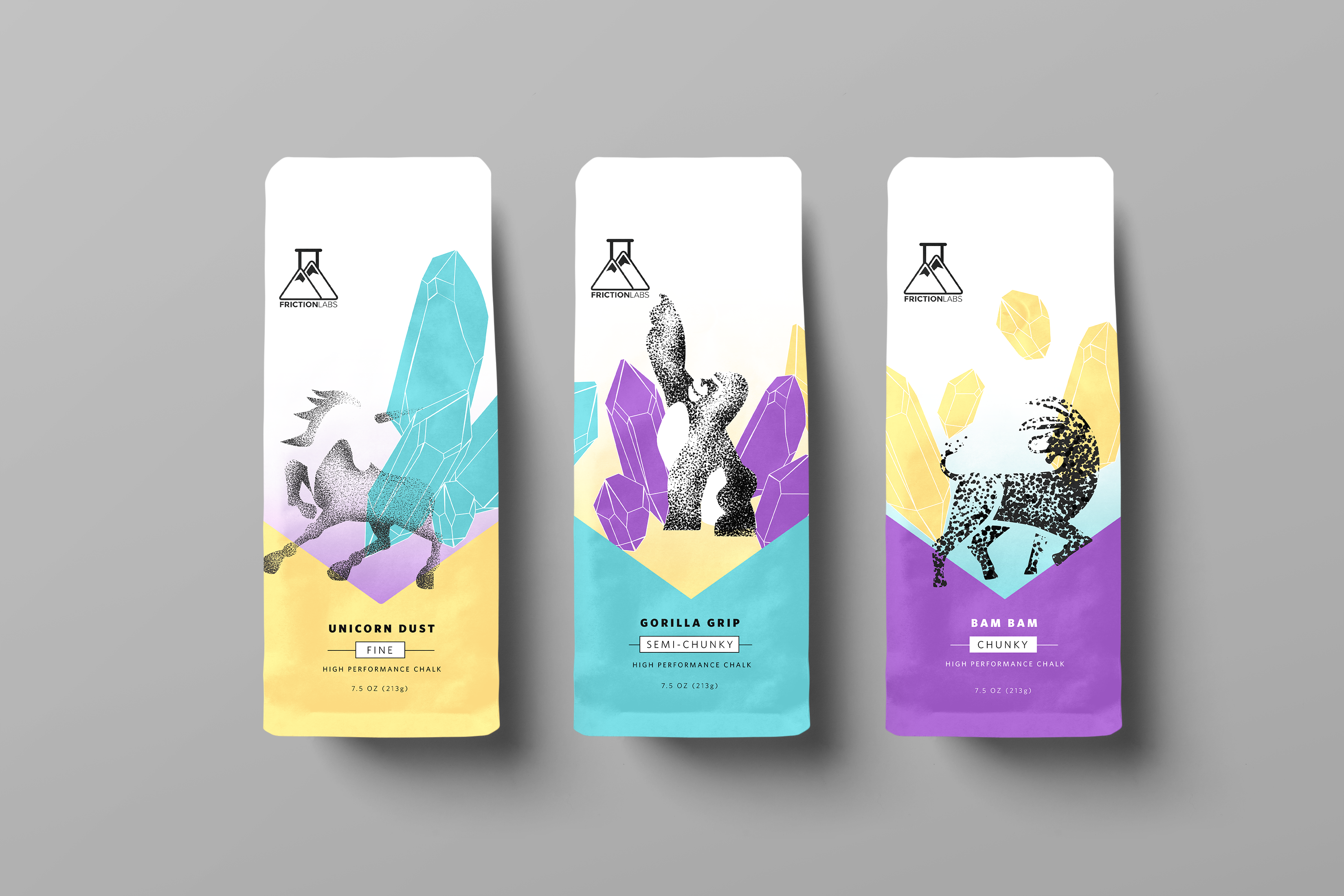
Friction Labs is a performance chalk brand used by many athletes. They released a request for proposal looking for ideas to reimagine their characters associated with their loose chalk line.
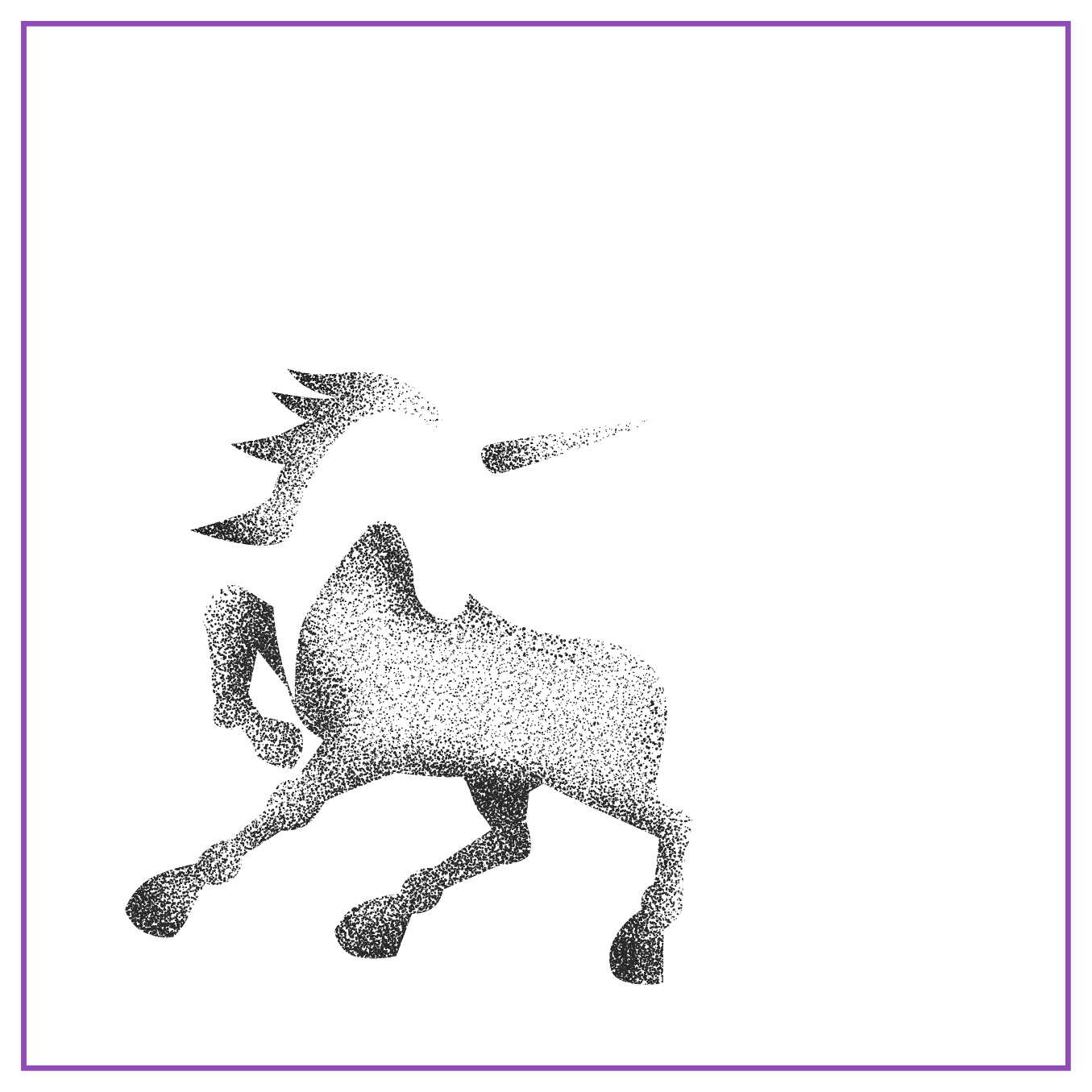
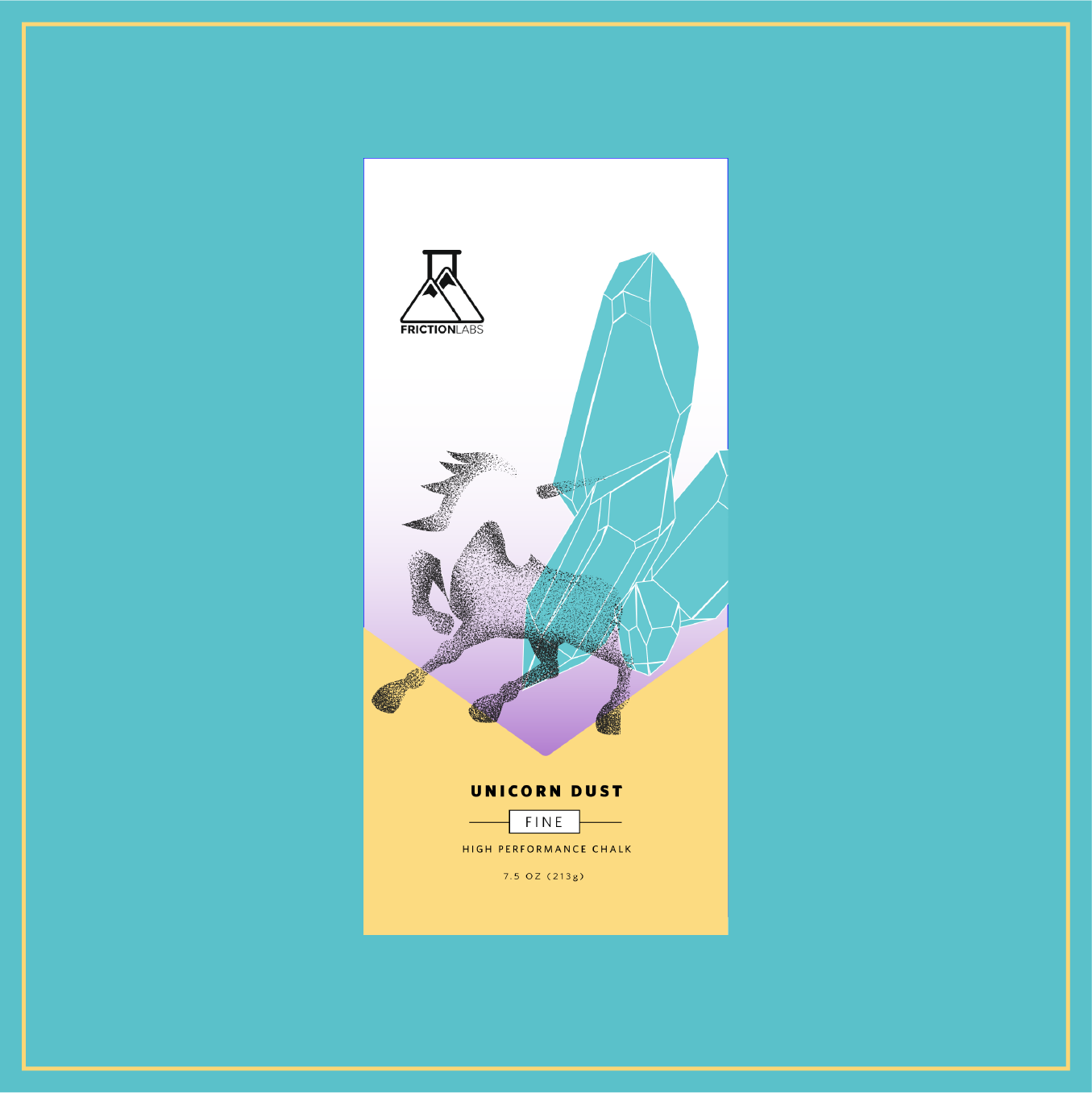
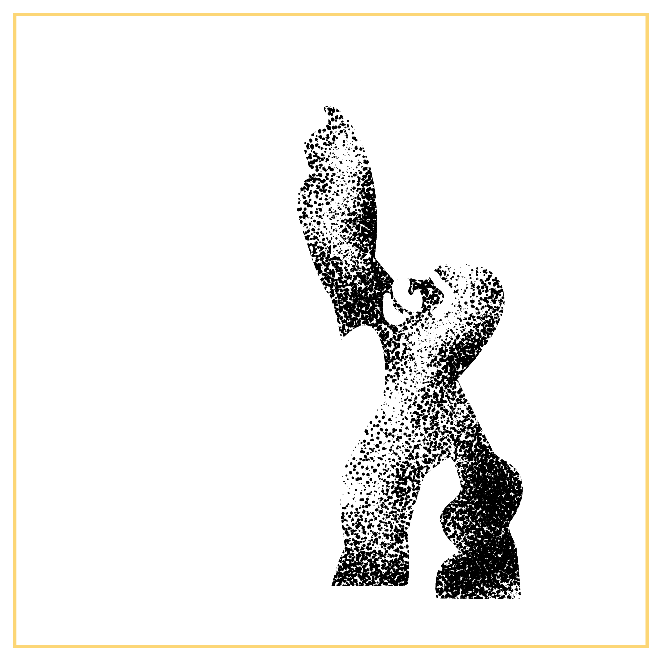
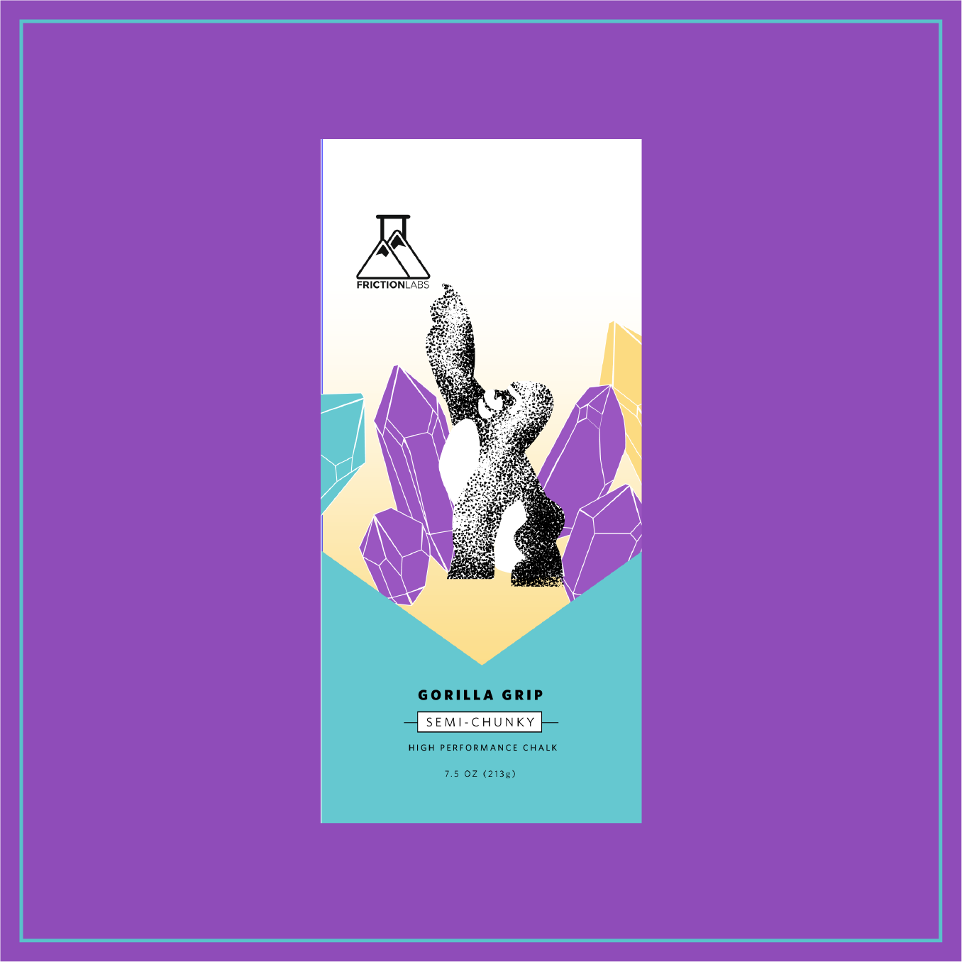
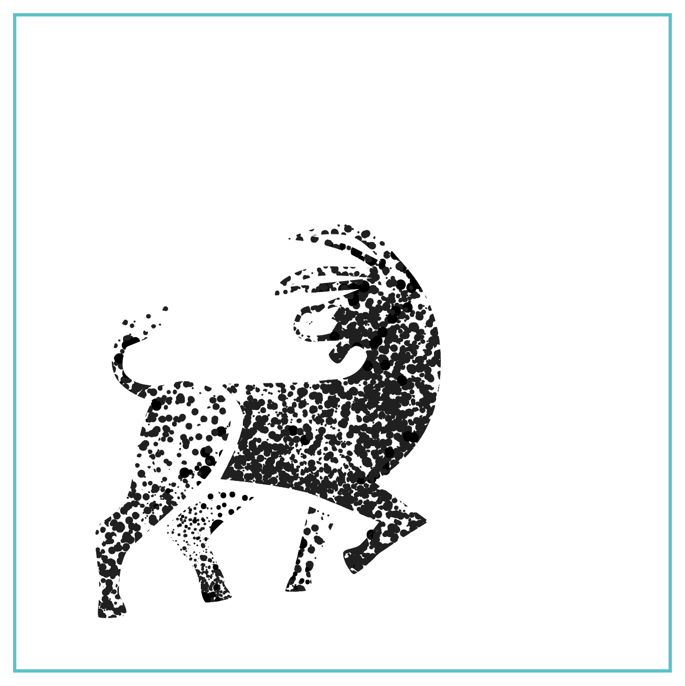
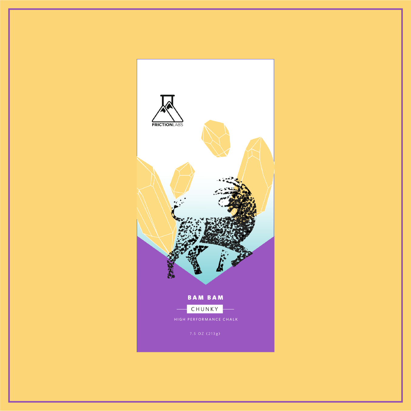
The reimagined characters are portraryed using a stipping technique to convey the very contents that are in the bags: chalk! The stippling technique is applied to relate to particulates as a way to display small units coming together to create something whole and allows for the use of variable sizes to denote the type of chalk one can find in each bag (so fine dots for "Unicorn Dust", medium dots for "Gorilla Grip", and chunky dots for "Bam Bam" represented the donkey), while echoing the scientific implications of the parent brand, Friction Labs.
The idea behind using the stippling technique came from imagining characters that retain familiarity through form but communicates inclusivity, by removing any perceived gender roles, feelings, or "machismo" implications.
Selected Works
artmixed-media

USQprint design
ChacoBrand Identity, Print + Digital
Fluff FestBranding
Glass HouseBrand Identity, Print + Digital
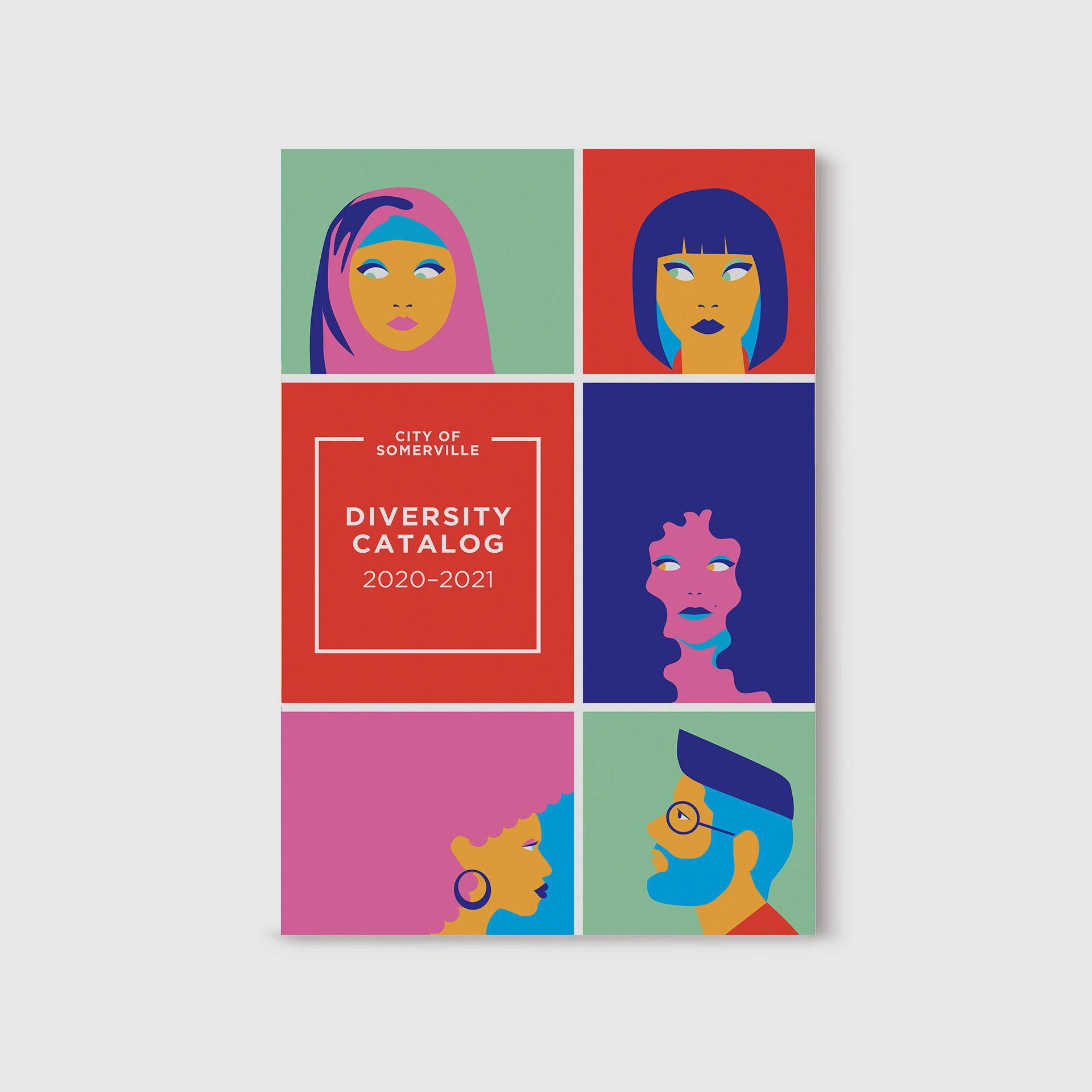
Diversity CatalogPrint + Digital, Illustration
CosechaDigital, Infographic, Illustration
Namaste FrenchiesBrand Identity, Print
Scratch Marketing + Mediagraphic designer

marlo marketingGraphic Designer

The ExploratoryBrand Identity, Print + Digital

Starting the ConversationBrand Identity, print

Friction LabsBranding
Just For LaughsBrand Identity, Print + Digital
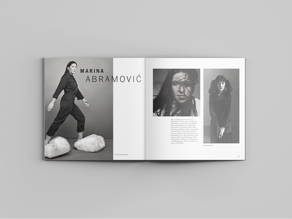
Conceptual VisionariesLayout + Print Design

MAMASIllustration, Layout Design

Rehearsal for LifeIllustration, layout, print

Design Museum BostonVideo Editing
Contact
directtolucy@gmail.com
@lookforlucy
© lucy nguyen | Graphic designer
built with Semplice
